Release Notes - July 2022
ZUI bundle size decreased by 300kBs after removal of Polymer dependency
The goal for July was to remove dependencies on Polymer in order to trim some kilobytes off of the ZUI bundle. We identified that Polymer made up ~300kBs of our bundle size and only two ZUI components were dependent on it: ZUI Tabs and ZUI Pages. Further, utilization statistics showed ZUI Pages was barely used by consumers. The few who did use ZUI Pages used it as a <div> wrapper and relied on their framework of choice to show and hide content when navigating between tabs.
ZUI Tabs rewritten without Polymer
One of the last ZUI components that heavily relied on Polymer was ZUI Tabs <zui-tab>. In our efforts to rewrite ZUI Tabs, we tried our best to keep the ZUI Tabs functionality the same to not break current implementations of ZUI Tabs in Zywave products. There may be minor differences, but nothing major that should prevent users from completing their tasks.
ZUI Pages removed from the ZUI bundle completely
Utilization statistics showed little to no use of ZUI Pages <zui-pages> and most consumers of ZUI Tabs relied on their frameworks to show and hide tab content. We collaborated with the engineering teams whose web applications were still using ZUI Pages to replace it with another solution, so we can get rid of this under utilized component once and for all.
[hidden] support breaking change
Did you know that HTML specifies a global hidden attribute? This attribute essentially tells the user agent styles to display: none; on that element, but due to how CSS specificity works, if a web author sets the display property to something else, it won't be hidden!
Unknown to ZUI, the library we used for some of our initial components (Polymer) introduced a sneaky style into everyone's pages:
<custom-style>
  <style is="custom-style">
    [hidden] { display: none !important; }
  </style>
</custom-style>
With the removal of Polymer, these styles are now gone, which means elements that were once hidden may not be any longer.
We have updated our base component host styles to accommodate, but it's important to call out that we no longer specify !important which could be a breaking change for some!
If you're currently setting a display property on an element but relying on the hidden attribute to hide that same element, you will need to remove this display property.
This change is consistent with native behavior, which is why we are omitting !important but we understand this could break some workflows.
If you'd like the old behavior back, you can add the following style to your application's CSS:
[hidden] {
display: none !important;
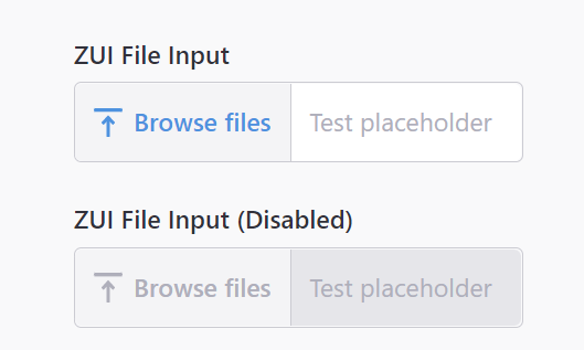
}Disabled state for zui-input-file
An overlooked design bug in our file input component, thanks to Carter Jasinski for resolving this issue!
zui-input now supports step
A small enhancement, but you can now supply the step attribute/property to a zui-input. It only applies to numerical inputs, e.g. number, date, etc.
<zui-input type="number" step="10"></zui-input>For more information on what step does, feel free to check out MDN's documentation on step.
Additional minor bug fixes
<zui-table-topbar>'s@slotchangeto invoke a single expression instead of multiple expressions- Inline ZUI Radio buttons
<zui-radio inline>previously had a height of42px, but it has been reduced to36px - Removed IE11-specific logos from
<zui-logo>
Documentation updates
Homepage gets a makeover
Hopefully you noticed the out-of-this-world updates to Booster's homepage! This effort was the fruit of a good amount of design love, and we're really excited about how it turned out.
The Booster documentation site is used by others outside the Zywave engineering organization, and we're now proud of what those individuals will first see when they come check us out!
API documentation headers are now deep-linkable
A small quality-of-life improvement, but we've updated the rendering of custom element API documentation to have it so that the headers are deep linkable! All headers under a component's API tab are now clickable, so if you want to share some documentation with a co-worker, just click on the link and copy the URL and send it off.
For an example, go check out table's events documentation!